


US UK
Gina
US: I really adore this cover because i love the colour purple on book covers. There's just something about it that catches my eyes. I think the model is beautiful but in a way this cover is kind of dull compared to the UK one. But i do love the victorian style of the umbrella and her lacy sleeve (all we can see of the dress).
UK: I love this cover!! It stands out from all the others and it's different. Although the guy is supposed to be dead he is definitely hot!! And i love that this cover shows what the book is about in the background (they are zombies for those of you who can't see). I LOVE the title fonts as well and they match the words perfectly. I definitely prefer the orange and red cover to the US one.
Conclusion: The UK wins!! I love everything about it and i cannot wait to read this book :)
Katie
US: I love this cover! I love the colours and the font and the tagline! I like how the model is looking down whilst holding an umbrella. You can also tell by this cover that it is obviously set in the past. I also like the background in this cover too!
UK: I’m not keen on this cover, the guy looks creepy looking. I know he’s a zombie but I just don’t like it. I like the colours in the background and how the sun is setting/rising (not sure which) and it reminds me of fire. I like the font, its delicate yet strong which could have to do with something in the book. By the clothing in this cover you can tell that it’s set in the past, I think.
Conclusion: Overall, the US cover wins, no doubt about it! :)
And for this week I (Katie) have chosen to do Angel by L. A. Weatherly which i am currently reading and loving.

US UK
Gina
US: Different title, same book. But if i saw the two on a shelf i would go to this one as the title sounds interesting and different. I think the font is a bit too plain but i love the pattern around the outside of the words. The image is captivating and i like the hair blowing in the wind and she's glowing too.
UK: I love the backgroun colours as the arm different but i hate the model. I don't know why but there's just something about her that's off and she's not very pretty. But i do like the wings and the title font, very delicate.
Conslusion: It's a draw. I can't decide because i love and hate these covers so i can't choose.
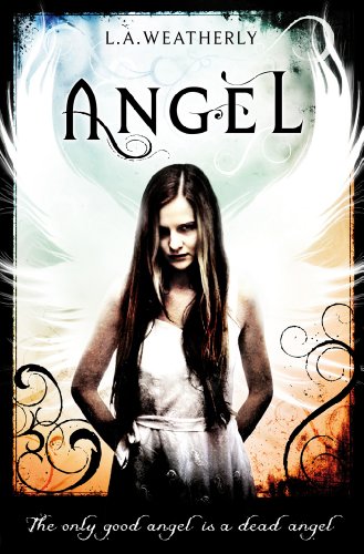
Katie
US: I don’t understand why the US has to have a different title name, but it does go with the book which is good. Comparing the title names I think that Angel Burn is better because it sounds more interesting whereas Angel is sort of plain and doesn’t grab your attention fully. If I’m honest, on Goodreads it was the US title that drew me to read the blurb.
I prefer the model on this cover because you can’t see her face and I like that on covers so you can picture the character in your head yourself. I like that her hair is glowing and fits in well with the book. I like that the font is big and stands out to you. The Burn part really stands out and shouts at you, I also like that it’s white behind it, showing the angel in it, obviously to do with Angel Burn (if you’ve read it you’ll probably understand what I’m talking about!)
UK: like this cover, there has been thought into designing this because of the designs around the edge and the wings behind the model. Speaking of the model; I’m not sure about her, I mean I’ve only read half of the book but I have not got the impression in the book that she is a nasty character (that’s how the model looks to me), her head is slightly tilted which reminds me of the picture that Alex finds of Willow. I think that the model is trying to look like the picture that Alex finds and I can honestly say that she isn’t meant to look creepy!
I love the design and colours on this cover which draws me in and I love that there is a border a swell, don’t see that on many covers!
Conslusion: In conclusion, I don’t really know…I like both covers for different reasons. If the model didn’t look so creepy on the UK cover it would’ve gone to the UK. But I’m going to give it a draw for this one. There’s something about them both that I like, but they both have their faults.


When it comes to Dearly,Departed I can't help but to be partial to the U.S cover. The UK one has a better backdrop and fits into the novel better but I can't get over the girls blank expression.
ReplyDeleteThe guy looks pretty fierce though, he could rock the cover on his own. LOL !