


US UK
Gina
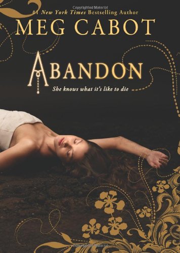
US: I loved this cover from the moment I saw it. The colours aren't overly bright but they are subtle and elegant. I especially love the gold flowery pattern that goes around the cover. I also think that the model is very pretty and suits this cover down to a tee. You can that by looking at this cover it is a book with a greek twist which is what it is. I love the browns and golds because it's different and i like different.
UK: I thought that they would keep the US cover but they obviously didn't and in a way i am disappointed about that fact. Don't get me wrong, our cover is different, unique and totally not like any other book i have seen. I think that it is clever having one side light and the underworld part dark and evil looking, making to two contrast well. I'm not sure about the models but i like that she is looking down at him. The red vines stand out against the black and white and i think i prefer the title font on this one than the US one.
Conclusion: Winning only by a fraction is the US. I smiply love this cover and i wish i had this version of it on my shelves :D Both are lovely but i definitely have my favorite :)
Katie
US: When I first saw this cover on Goodreads, I really liked it and it made me want to read it even more. I love how the model has mirrored the meaning of Abandon. The colours are slightly faded and aren’t in your face which I quite like. The design around the cover is really pretty which makes it stand out even more.
UK: I quite like this cover but I’m not really fussed. I love that it adds the story up into one picture with Pierce in the white showing she is living in the world but John is upside down and dark showing the underworld. No offence but the guy is not good-looking at all and when I read this book, John was sexy, however the male model on the cover is not. The girl model is okay and I love that her white dress fans out around her which then looks like a pool of water that has been encircled around her. I also love the red design around the sides, which in real life it shines which is nice and catches your attention more! :)
Conclusion: I prefer the US cover because the colours are more appealing and looks more like a young-adult book, whereas the UK one doesn’t as much.
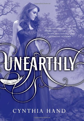
I (Katie) have chosen Unearthly by Cynthia Hand which both of us have read and loved by the way. Here are the beautiful covers :)

US UK
Gina
US: I love this cover so much. It was this cover on Goodreads that drove me to checking out the book and then buying it in the first shop i got. I really liket he dress that the model is wearing as well, even though the title is covering most of it. And speaking of the title, i really like the way there is a feather in the tangles. Having the whole cover tinted purple is different and makes us look at the whole thing instead of just one specific spot on the cover. And because i have read the book i get why she is in a forest.
UK: Our version is differnt. But the thing i don't like about this cover is the model. She looks quite scary actually and wayyyy too white for my liking. I know she is supposed to be glowing (Clara the angels glows) but it's just too much. It should be subtle and it isn't. The title font is very bland which is bad but at least they still have the tress surrounding her. Not the best cover ever.
Conclusion: US wins!! Everything about their cover is better than our one :)
Katie
US: I really like this cover; it’s pretty and stands out to you for all the right reasons. The font is appealing and stands out. The model looks natural whereas in the UK one she looks stiff which isn’t cool for a bestselling book that needs a striking cover! The dress is lovely yet simple which I like. Obviously the model is in the forest which links to the plot. This is an amazing book so this cover definitely sells it!
UK: This cover is okay but I’m not its biggest fan. There is meaning in this cover such as the glowing dress and the woods but it seems too boring for me, I’ve wanted this book since I signed up to Goodreads in March and when it came out I was so happy, but the only reason that made me want to have this book was the description, but it was the US cover that won me over.
Conclusion: US cover wins because it’s so much more interesting with the font, model and background. Totally deserves it!!


0 comments:
Post a Comment