


The Book that I (Gina) have chosen for this week is Fury by Elizabeth Miles. i recently reviewed this book and really enjoyed it so here is what i think of the covers :)

US UK
Gina
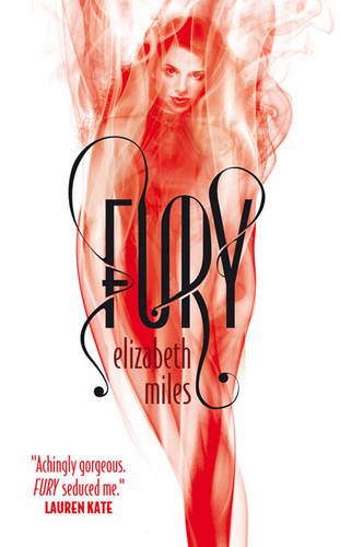
US: This cover is definitely different. The redness of her hair turning into mist at the ends is genious and ties in well with the book and who she is in the book. I love the dress because it isn't in your face yet it is still beautiful and elegant and the green ribbon just makes it perfect. It there was more colour to this then it would definitely become too crowded. i really like the gold colour for the title as it stands out yet still blends in perfectly with the background image. I really like this cover and it will be hard for the UK to beat it.
UK: I love that the red stands out so much on the white background and it instantly draws your attention to the fugure within the mist/flames. When I think of the work 'Fury' I instantly tie the colour red in with the word because they just go perfectly together. Again the title font for this is great with the swirly patterns and in a way i like it better than the US one because it has the letters joining with each other.
Conclusion: God...this is so hard! i honestly cannot decide between the two because i like them both just as much as each other :D So it is a draw once again from me (why do book covers have to be so pretty)
Katie
I haven’t read this book (yet) so I can’t judge the covers into which I prefer the most, so I’m only judging Fury by what I like on the cover.
US: I like how the US version is completely different to the UK one, yet if you think about it they are sort of the same. Both the US and UK cover have mainly three colours on them, but the UK looks very simple whereas the US one looks quite busy but it still grabs your eye. The US cover has also blended out the model’s hair colour into mist, which is the same as the UK cover.
The model looks very pale against her dress but her hair lightens up her body and face making it eye-catching.
UK: I quite like this cover, I like that it’s simple yet it grabs your attention. I love the font of Fury and that there are decorative designs around it which also makes it more attention grabbing. The model is obviously in red which kind of links with the meaning of the word Fury; anger. I also love that the colours blend off the red which is better than the model just being red, then the background going to white. It blends out nicely.
Conlusion: I’m not too keen on either of these covers so I don’t really know which country has done best with these covers. I think I’m going to go with US because the model looks as though she could relate to the plot of the story more.
The book that I (Katie) have chosen is Between by Jessica Warman which i am curently reading and loving. Gina has yet to read this book.


Gina
US: I love this cover so much!! I haven't read the book yet so i don't know how much meaning this cover has to the book but it's a great cover. It just screams ghost story and I would know instantly that this book has a paranormal element to it. I love the way her hair falls in front of her face which gives i an edge of mystery and the swings are really good too! It just says to me "This is a ghost book" and it gives off that vibe that lets you know something is off. The Title is really good aswell, with the way it looks as if it is disappearing or fading out, just like a ghost.
UK: I don't like this cover as much as the US one. To me this book says "I'm a romance novel and I'm nothing to do with ghosts." Which is kind of bad as it is about ghosts. The title is just too plain and boring and so is the cover.
Conclusion: 100% US!! I love everything about it and I love my covers to be spooky looking with an edge of mystery :)
Katie
US: I quite like this, and I understand what the cover is saying. Elizabeth is in Afterlife and by sitting on the swing it kind of shows that she is hanging in Between and doesn’t know where to go/what to do. I love that the model is looking down as it shows that she is watching the world from above. I have also just noticed the background is the opposite way; the clouds are at the bottom and the fields are at the top of the screen. This could represent that her world has been turned upside down.
UK: Beautiful book cover. If I’m completely honest, it was the book cover that made me pick up this book in the store even though you shouldn’t judge a book by its cover! The colours are gorgeous and I love that Jessica’s name shines a nice blue. The blue obviously takes a huge part in this book (I am currently reading this), due to Elizabeth’s death of drowning. I love that the model is looking to the left as if to say she is looking into the past which is what happens in this book whilst she is in Afterlife or Between.
Conclusion: I prefer the UK cover for the beautiful colours and the model’s pretty appearance, but I prefer the US cover for the fact that it shows part of the story in the cover. It's a draw.


UK covers are almost always way cooler than US..lol. Found you on goodreads Readers who blog and now following you.:)
ReplyDelete